Power BI Projects by CA Rathinagiri
Chartered Accountant, FinTech Professional, and Educator sharing open-source custom visuals and animated infographics to demystify complex Power BI concepts.
Custom Visuals Gallery
Explore my open-source custom visuals designed to extend Power BI's capabilities.
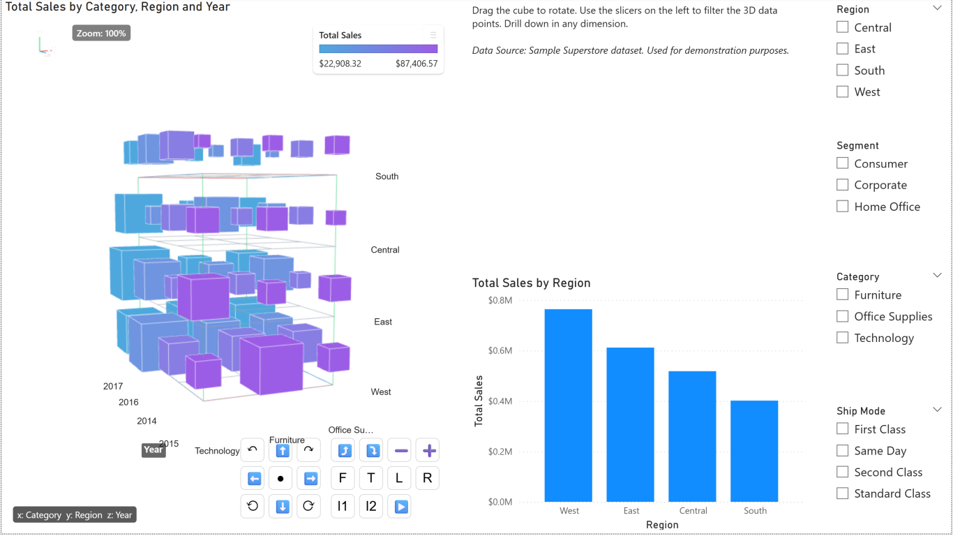
DataCube 3D
An interactive, open-source 3D visual for Power BI that helps users visualize multidimensional data. Explore Data Cube operations—Pivoting, Dicing, Slicing, Drilling Down, and Rolling up—through dynamic 3D cube animations.
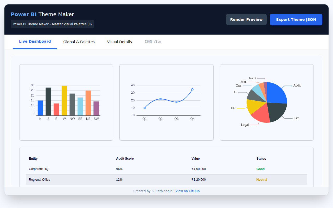
Power BI Theme Maker
A single-file HTML application for generating, customizing, and validating Power BI JSON themes. Visually design themes, preview them in real-time, and export the resulting JSON configuration for direct import into Power BI.
Power Query
Explore exercises and mind maps to master data transformation with Power Query.
Power Query Exercises
Practice data shaping and transformation with a set of Power Query exercises along with sample data in Excel.
Time Intelligence Mind Map
A comprehensive mind map detailing Time Intelligence functions and concepts in Power BI.
Infographics & Reports
A collection of interactive, animated infographics designed to demystify complex concepts and make them easy to learn.
OLAP vs OLTP
An interactive infographic that visually demonstrates OLTP vs OLAP: at a Glance and why Columnstore databases are used in analytics.
View Infographic →OLAP - Data Cube Operations
An interactive infographic that visually demonstrates OLAP data cube operations—Pivoting, Dicing, Slicing, Drilling Down, and Rolling up—through dynamic 3D cube animations linked with tabular data.
View Infographic →Star Schema Filter Flow
This visual demonstrates how filters cascade from dimension tables to the central fact table, including bidirectional relationships.
View Infographic →DAX Filter Context Water Plant
An interactive model that explains the DAX filter context hierarchy and how CALCULATE() can modify the flow of filters.
View Infographic →Filter Context Camera
See the SUM measure act like a camera while report, page, visual, and slicer filters choreograph who steps into the spotlight.
Open the Camera Page →Row Context vs Filter Context
Learn the foundational difference between “current row” and “visible rows” before moving on to context transition.
Open the Foundation Page →Context Transition Lab
See row context become filter context through a commission example that compares a plain SUM with CALCULATE-wrapped evaluation.
Open the Context Transition Lab →SUM vs SUMX Lab
Compare plain aggregation with row-by-row iteration using a practical order-lines scenario with quantity, price, and discount.
Open the SUM vs SUMX Lab →Calculated Column vs Measure
See the difference between stored row-by-row model values and dynamic report-time calculations that change with filter context.
Open the Column vs Measure Lab →ALL vs ALLEXCEPT vs ALLSELECTED
Compare grand totals, grouped subtotals, and selected totals using an animated percent-of-total sales scenario.
Open the Filter-Shaping Lab →Date Filter Context Train
Explore how DAX date intelligence functions stay on track using a train yard animation that demonstrates current, previous, and next period calculations.
View Animation →Stages of Data Analysis
Step through the iterative stages of data analysis with illustrated diagrams that connect business questions to measurable insights.
Explore the Stages →Choose the Right Power BI Chart
Browse chart types, learn when to use them, and generate animated ECharts previews for Power BI storytelling.
Open the Chart Guide →Power Query Joins Playground
Experiment with Left/Right/Full, Inner, and Anti joins using Orders, Customers, and Products linked with live Venn diagrams.
Explore Joins →Tutorials & Case Studies
Hands-on case studies and real-world scenarios to elevate your Power BI data modeling and analytics skills.
Power BI Case Study 01
A comprehensive data analysis case study covering modeling, DAX, and report creation.
Power BI Case Study 02
An advanced case study focusing on complex scenarios and in-depth data transformation.
Case Study 01 (Purchase Data)
A focused case study applying analytics to real-world purchasing data records.
Case Study 02 (Form 26AS)
Practical real-world examples reconciling and analyzing Form 26AS tax statements.
Case Study Source Data
Download the source data required to complete the exercises in Power BI Case Studies 1 & 2.
Power BI Practice Workbook
Download the companion Power BI workbook to experiment with the scenarios covered in these visuals.
Download PBI.xlsx ↓